


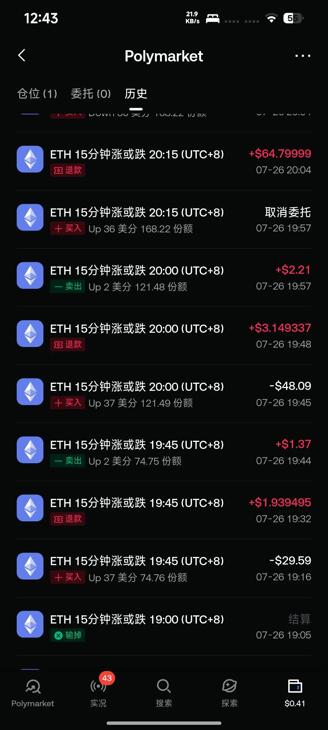
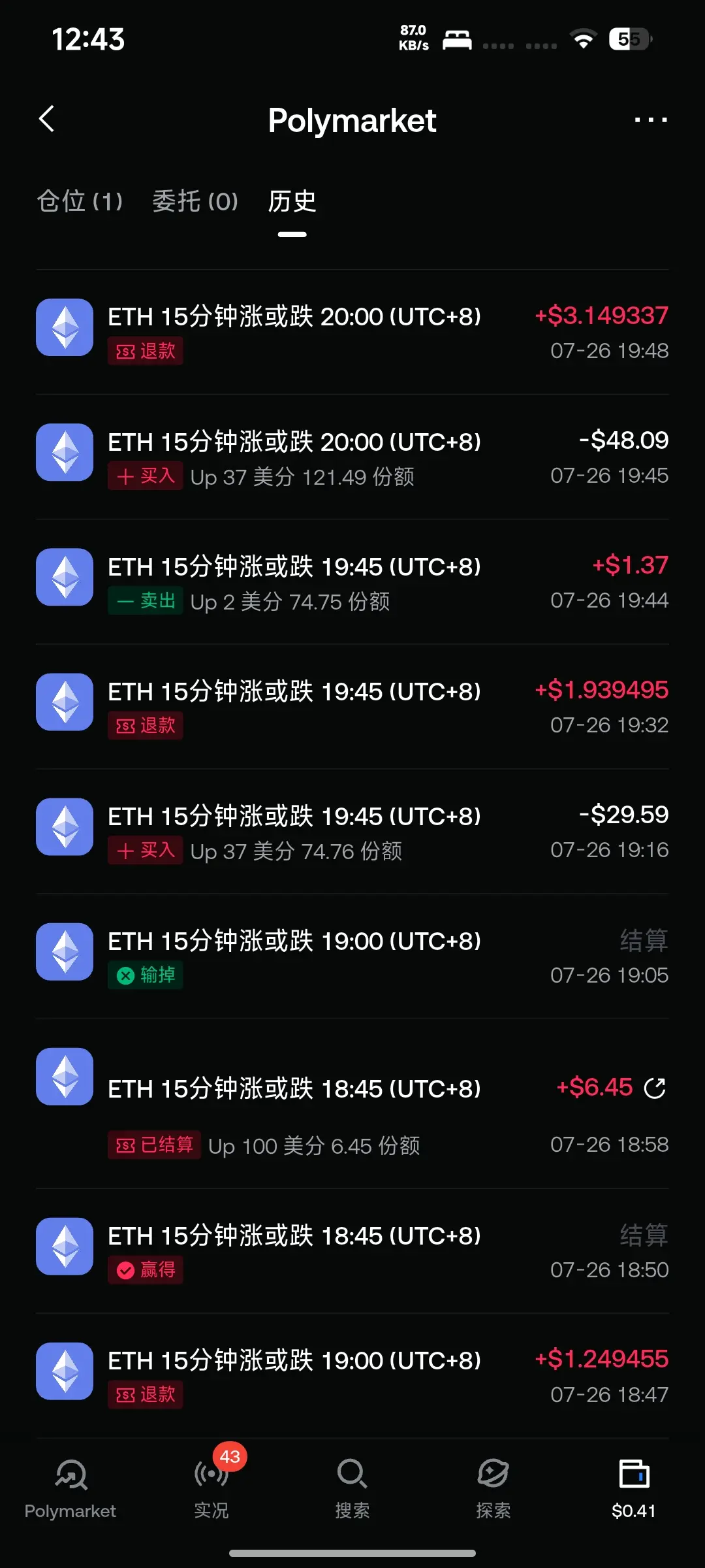
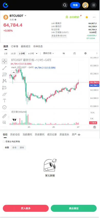
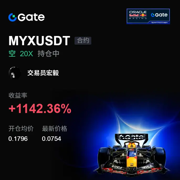
#SharemyHoldingreturn
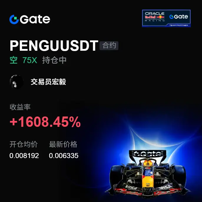
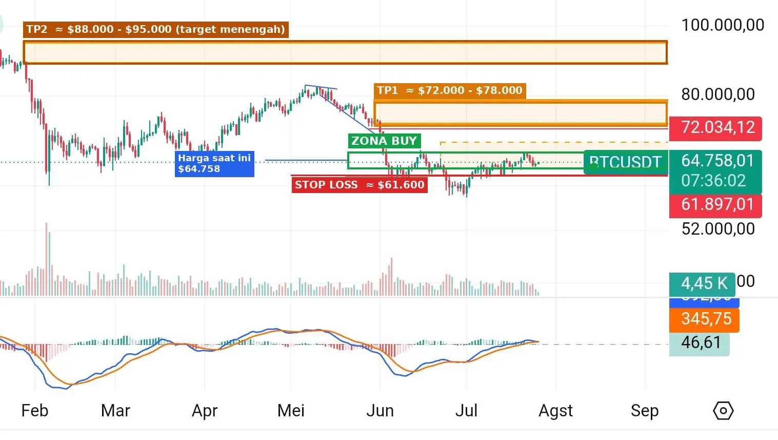
SL 70500
TP 49500
Never try to catch a falling knife🐂🀄
I will stop trading if my analysis this time is wrong.
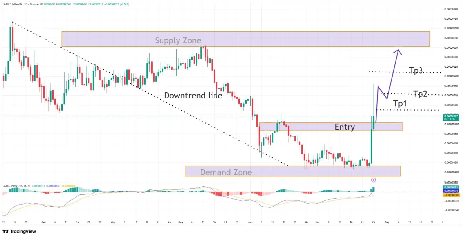
SL 70500
TP 49500
Never try to catch a falling knife🐂🀄
I will stop trading if my analysis this time is wrong.


1.59M Popularity
146.98K Popularity
962.08K Popularity
153.28K Popularity
10.53M Popularity